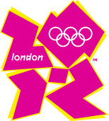
When I first noticed this in one of my feeds, I thought it was a joke. After visiting the official website of the 2012 Olympic Games I realised it was the real thing. The new brand cost £400,000 and it took one year of research. I’m sorry but I hate it. I think it’s ugly, ugly and.. ugly! I’d love to read your thoughts on this.
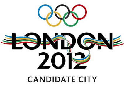
Just for comparison, here’s the previous logo:

There’s an online petition going on to change the logo. At the moment, there are 13.286 signatures! Go and sign!